For the rest of April, I will be continuing my digital declutter process, lifted right from the pages of Cal Newport's Digital Minimalism. Among other things, this means for me freedom from any sort of social media (other than maybe LinkedIn for its job postings), a complete absence of video games, and worst of all, a heavy throttle on my Reddit and Youtube intake. Podcasts and music are likewise minimalized. Netflix, Hulu, Dropout, and other streaming services are off-limits unlesss I'm watching with other people. Basically, all optional technologies on my life are on hold while I reconsider their hold on me.
In the meantime, I am taking the time to "explore and rediscover activities and behaviors" that bring me meaning and satisfaction. I'm already reading more than before, I'm more focused on my design work, and I even picked up some new cocktail recipes. These high-quality activities, in theory, quell the boredom and anxiety that can arise from suddenly losing all my little addictive apps and games.
Once the experiment is over on May 1st, I will reintroduce some of these optional techonlogies back into my life, but with strict operating procedures in place to keep them in check. For example, I imagine I am going to keep the rules for streaming services in place even after the digital declutter ends. The amount of time I lost just wasn't worth the extra jolt of entertainment, even under the guise of necessity of rest and relaxation (and therefore, theoretically, letting me work harder). While I'm balancing my freelancing work with the jobhunt, I need to seize every tool and technolgy and judge how much value it really gives me.

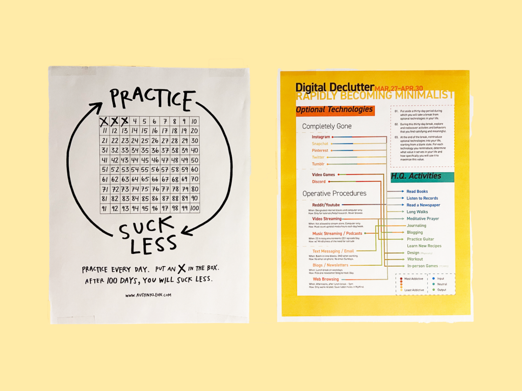
From the start of this experiment, I've wanted to have a clearly-written manifesto of my digital declutter protocols. Ideally, I'd hang it in a place I would see every day to remind me of my own rules.
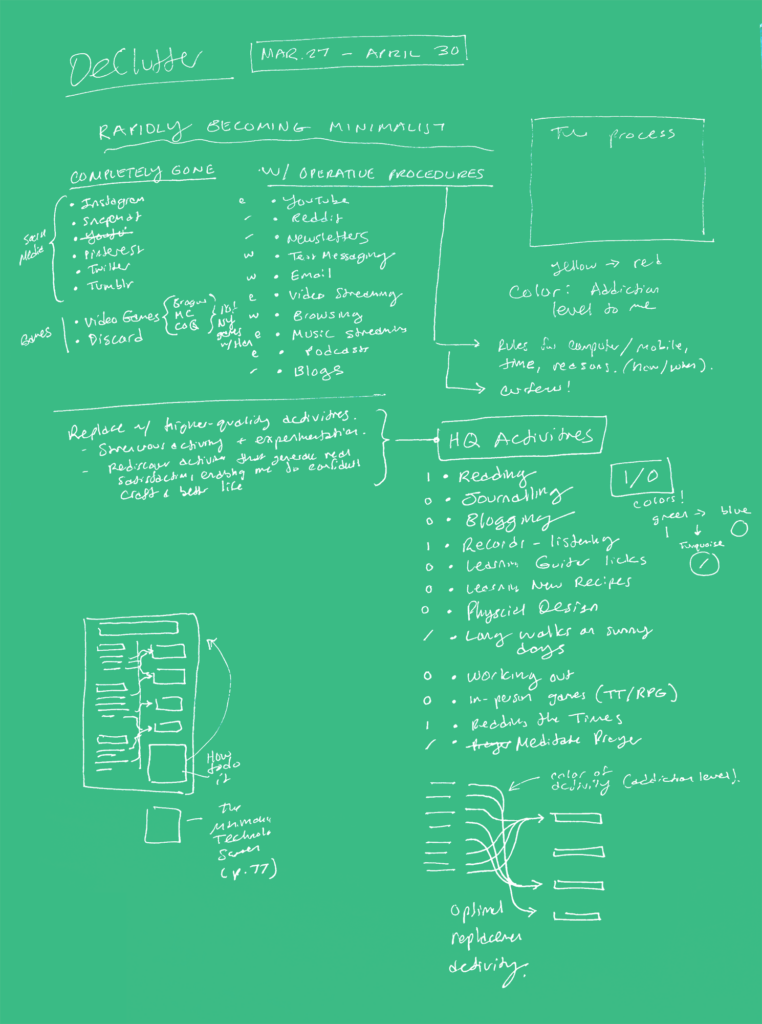
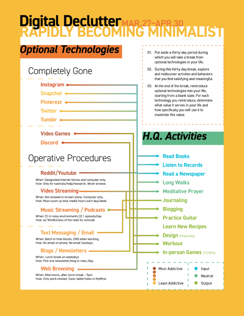
I wondered if I could do myself one better and design an infographic one-sheet that explained all the optional technologies in my life and all the high-quality activities I would replace them with. Instead of just a hand-written manifesto, I wanted a simple flowchart that clearly showed how I could use the time typically eaten up by Instagram, Discord, and unrestrained web browsing.
However, since spending a day on this infographic would not have been the best use of my time, I gave myself only an hour to design and develop it. Issue #1: I should have spent more time sketching out how the flowchart would work, because—spoilers—it just didn't.
Color-coding
The idea that got me really excited was to color-code each of the activities. The low quality, optional technologies were distributed on a warm to hot scale. Yellow represented a less addictive and less prevalent technology in my life, while red signified dangerous levels of influence over my (lack of) willpower.
High-quality activities, on the other hand, were grouped by genre. Blue represented input: activities where I absorb information, such as reading a book or listening to music (a full album, no shuffling, vinyl preferred). Green showed activities of output, where I was bringing something new into the world, like journaling or practicing a guitar lick. Turquoise represented activites that I believed hovered in a neutral space in between input and output. I/O, as Superbrothers once put it.
Revisiting now, I think I would contest some of these labels. The two "neutral" I/O activities seem like they would fit, if I had to choose, in the input category. And many of the output categories are a mix of I/O when you really think about them. (TTRPG's, for example, require a vast amount of listening [input] and role-playing [output]).
For the flowchart itself, I tried to blend the two colors—the warm optional technology with the cool-toned replacement H.Q. activities in their corresponding arrows. Not only would this create a pretty gradient, but—I assumed—the various colors would clarify where lines overlapped.
In theory, this seemed like a great idea.

Issue #2: the lines ended up just fusing together in a brown muddle. It's borderline impossible to follow some lines to their endpoints. But, I realized after I was done, the flowchart is largely unnecessary. Yes, I could technically use it when I was particularly missing something like YouTube or Caves of Qud to find a suitable replacement activity. Ideally, I'd match each one up with an activity that would scratch the same itch. In-person games instead of video games, for instance, or read a newspaper instead of scrolling Twitter. But I haven't ever felt like I've needed to check the flowchart for an idea of what to do with my time. Often, I just instinctively move into a high-quality activity that feels right for the moment. Sometimes I come up with activities that aren't even on this list.
What worked?
In the end, the most important part of this entire thing was the tiny print under the technologies labelled as including operative procedures. These procedures ensure that I stick to my guns and don't cede in a moment of weakness. As long as I stick to internet-blocking, Reddit and Youtube, which I have noted as tools I may need during this time for help and tutorials, are leashed until they no longer threaten my time. With my time-block calendar, I can schedule time to check my phone and email instead of letting it choose when to interrupt me.
Although a good chunk of this design ended up unhelpful—and kind of ugly, if we're being honest—it's still reminding me what I've agreed to surrender. It also, at the very least, is a record of where I am today, with both my device struggles and my design failures. It hands on my bedroom wall, which would be otherwise completely blank if not for this page and the Austin Kleon "Practice > Suck Less" paper I use to mark everytime I post, and the moment I hit "Publish" right now I can mark another x in that grid.
One day closer to true digital minimalism.


No Comments.