
A wonderful organization I've had the privilege of working for in my short time freelancing is Reach Hurting Kids Institute, a team who provides trauma-informed children's ministry resources. As a previous youth leader and coordinator myself, I've found their work and training invaluable. And now as a designer, I've been able to work with them on projects as simple as postcard-sized flyers and as big as pop-up exhibit backdrops.
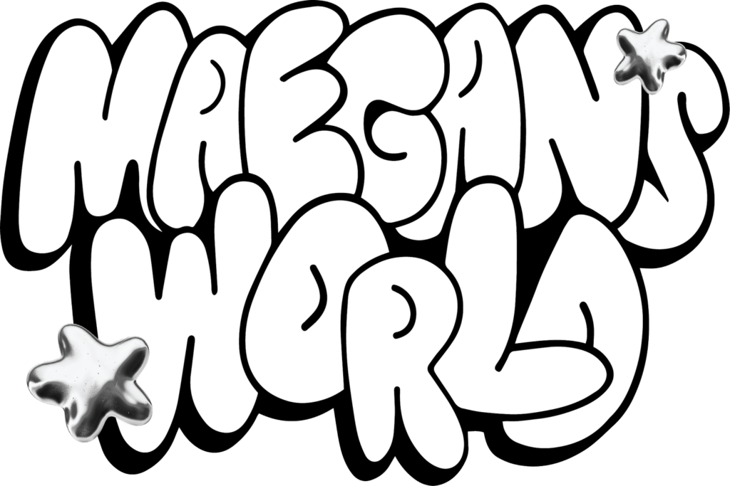
This week's project for RHK was a lesson plan in partnership with Maegan's World, a creative communicator steeped in kids ministry. Though the lesson itself was written by RHK, I wanted to find a small way to combine the two brands together in this handout.
I found inspiration in Maegan's logo—a beautiful bubble-letter custom typeface—and decided to make little icons to indicate the start of a new section on the lesson plan. Rather than going to my usual haunt thenounproject, I wanted to make the icons myself. Maegan's logo immediately suggested a similar soft, inflated illustrative style, with deep shadows to the bottom left. I gave it a shot.
I also knew that this was something that I would want to perfect if I had the time for it—which I did not. So I had to limit myself: 30 minutes of sketching and exploration, 1 hour of re-working them in illustrator and importing them into the document.
Final thoughts
In the end, the final icons weren't that different from the initial sketches. I ended up exaggerating some poses and had to tweak them all to be somewhat similar in line weight, but that was it.
Overall, not my favorite thing I've done. Also, looking at the completed lesson plan design, it does feel slightly unneeded. The typographic hierarchy was working well enough on its own.
That said, I tried something new. Icon design doesn't feel like my thing, but it helps to know that if I run into a project that requires it, I'll find a way to whip something up again.
No Comments.