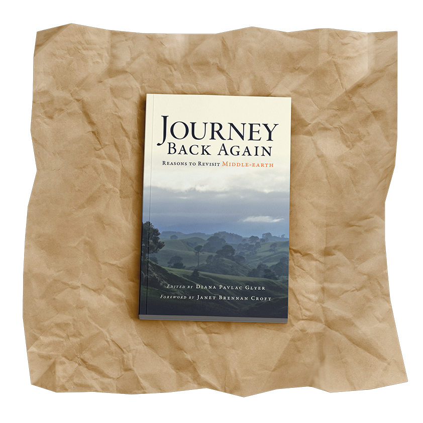
Journey Back Again: Reasons to Revisit Middle-earth illuminates the overlooked facets of Tolkien’s Lord of the Rings, guaranteeing that it is worth reading and re-reading, again and again. They approached me for the design for its second edition under the publication of Mythopeic Press.
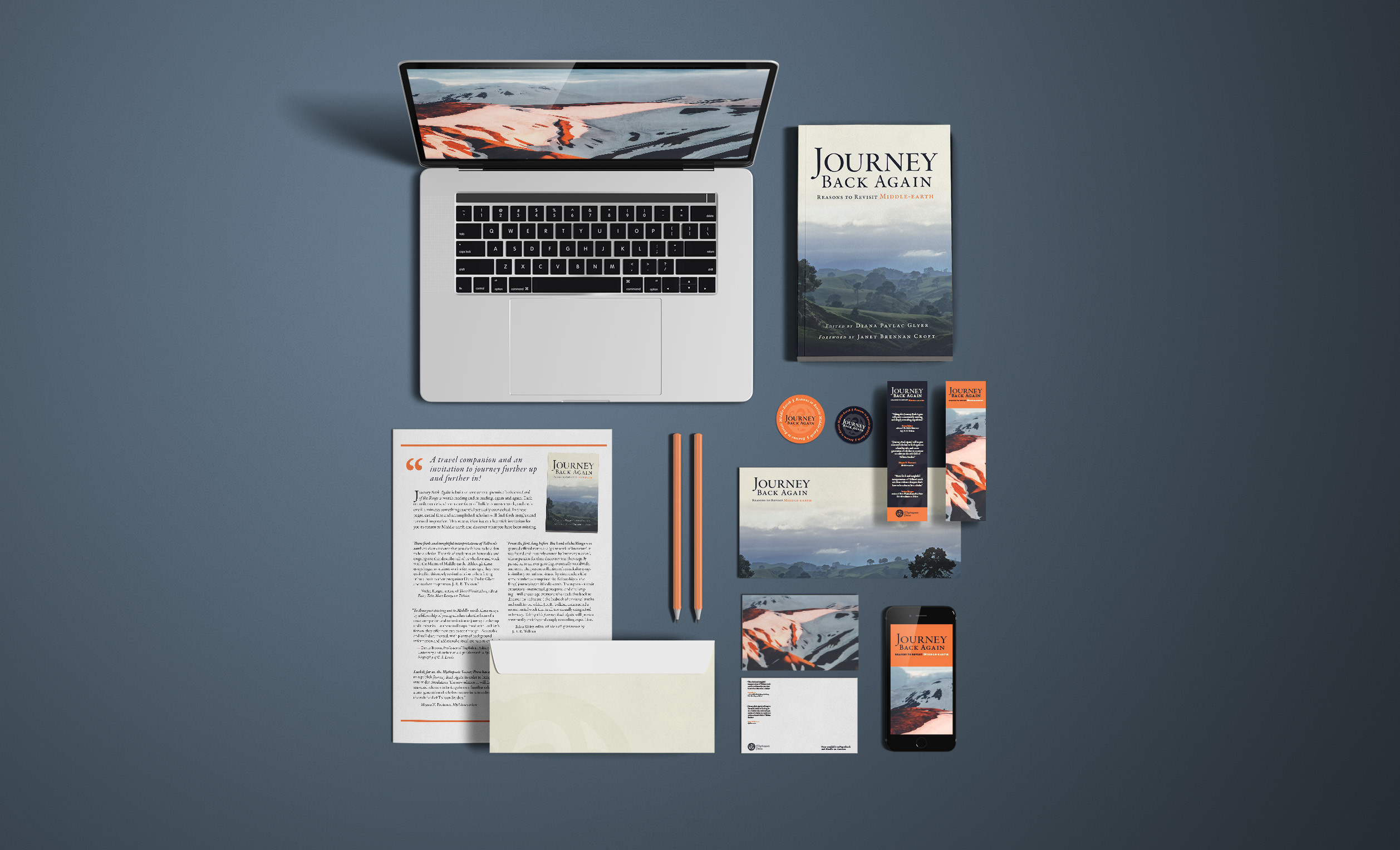
As the publication day drew near, the team chose to scrap their previous vision for the book cover and needed a new one—fast. I not only had the opportunity to create the color and typographic systems for the front and back covers but also design their marketing material: postcards, bookmarks, stickers, flyers, and anything else they needed for promotion.
Role: Graphic Design
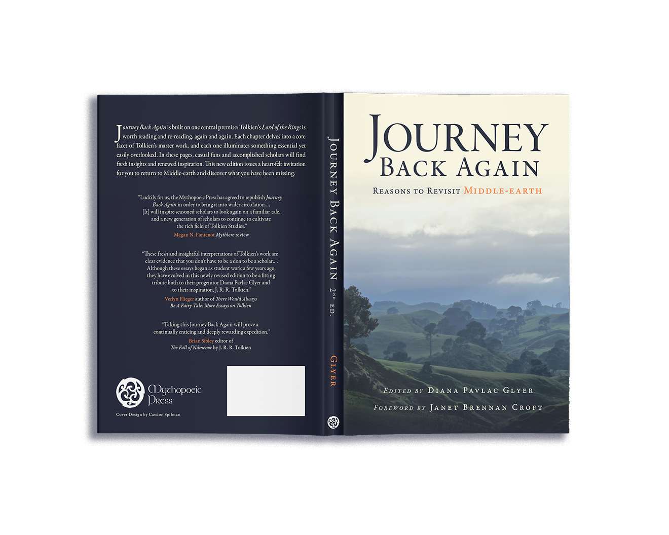
Client: Diana Pavlac Glyer & Mythopeic Press
Photography: Tobias Keller & Norris Niman
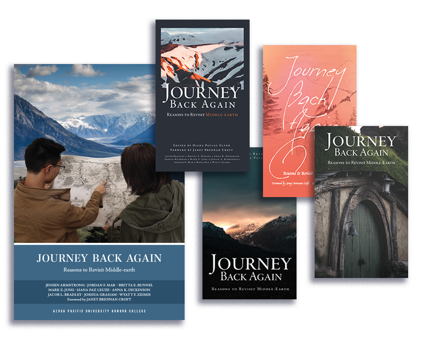
Exploration
We began with a review the first edition, published by Azusa Pacific University’s Honors College, and spring-boarded from there. After some quick, initial explorations with type, layout, and photography, we settled on an image that conveyed Journey Back Again's intriguing promise and yet remained faithful to the book’s original appearance.
Development
On such a tight schedule, I nailed down the color and typographic hierarchy from the start. We finished the title first, and the rest of the typography fell in place.
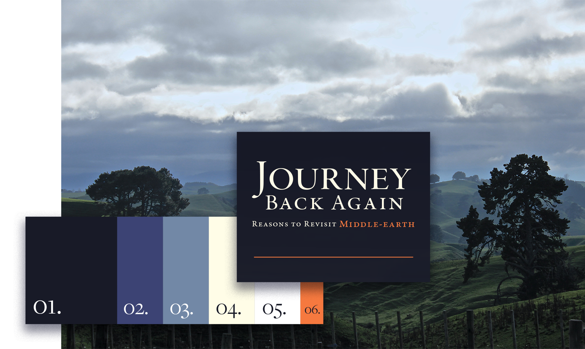
Photography: Tobia Keller
After the cover was locked in, the writers asked for promotional material—note cards, postcards, bookmarks, stickers, and fliers.
Results
Journey Back Again: Reasons to Revisit Middle-earth was published in November 2022 and hit the best-selling list on Amazon for Christian Literature. It is available for print and Kindle on Amazon.
© 2024 Caedon Spilman — Design & Creative Direction
hello@caedonspilman.com