Bit by bit, the website is coming together.
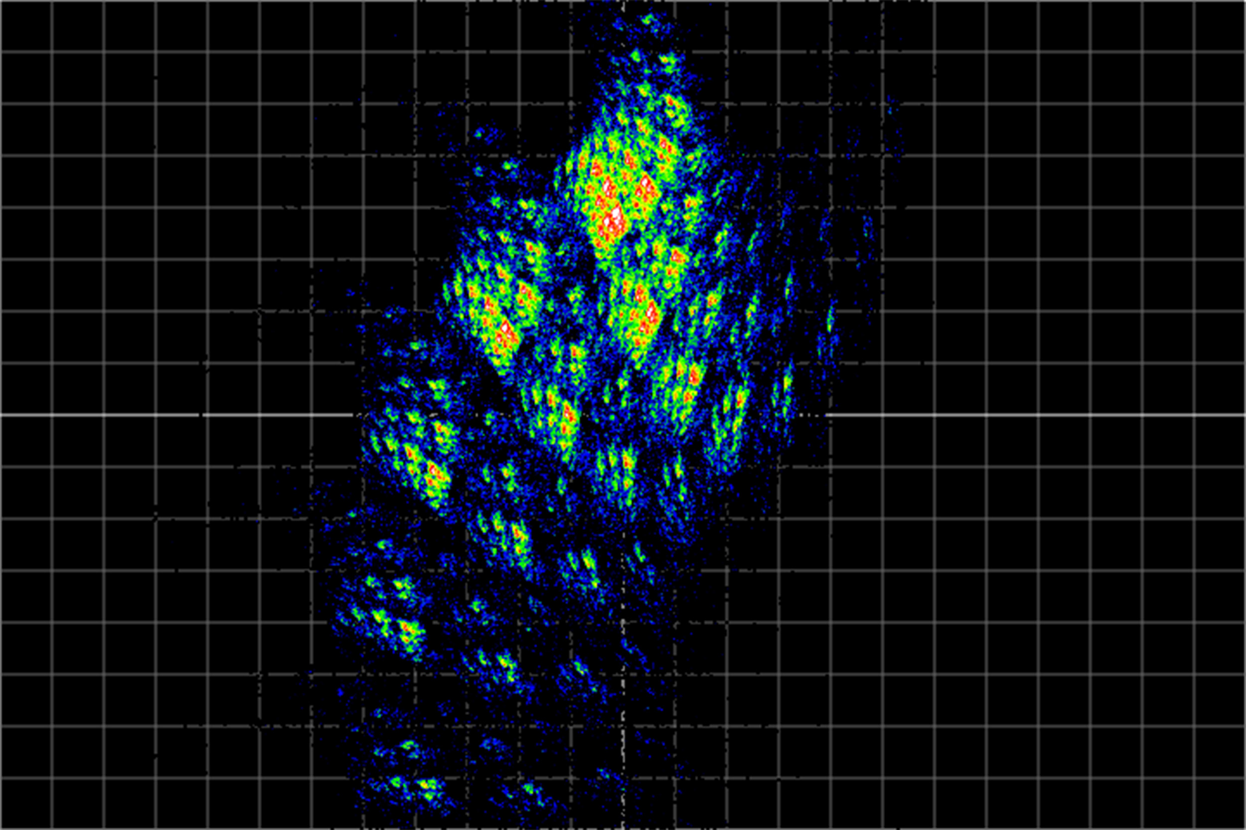
I subscribe heavily to the mantra I found on designer Nico Chilla's website, "My website as a home." This idea came from a beautiful 90's/early 2000's style website by one John Whitehouse. John is a hobbyist mathematician who loves to show off images he's created by experimenting with different math patterns—but he also displays pictures and artwork by himself and others. It is, effectively, a digital home for all his interests, piled up in one happy basket.
While this philosophy works for Whitehouse—and Chilla too, he also seems fascinated by the idea—it becomes more difficult when my website's primary purpose is a portfolio.
I need this place to be neat and tidier than most homes, because the guests that I want to present it to could include a potential recruiter or future boss. The front page must showcase my best work effectively and efficiently. Anything that does not serve the portfolio's purpose—or my own career goals, for that matter, gets cut. Which is unfortunate, especially as I want to make this place a hub to garden and maintain for years to come.
My manifesto, aka my very first post here, declares in item #2 that this domain must, eventually, become "my studio, my workspace, my cabinet of curiosities, and my gallery." Somehow, I want to shape it into something that can emulate those four distinct scenes at once. Without corrupting the mission of the front-page portfolio, that is.
My solution: I start to hide things away. Some pages that I really like, like the play page, I've tucked away for now. If it doesn't contribute to me getting a job, it shouldn't, supposedly, be on the home page.
Nor do I need to trash my hope for a digital home. I know it will become one, eventually. I believe that that even those "unnecessary" pages are still essential.
Perhaps there's a recruiter who's more interested in what I did last weekend than whatever's on my portfolio grid.
Perhaps I do manage to build a solid enough mailing list to get a newsletter started.
Perhaps I find myself enjoying my photography hobby more and more because I have a regular place to post it each week.
It'll be a home, maybe.
(Image from John Whitehouse's website).
In other news,
The home page is looking better than ever. I brute-forced a portfolio grid template into doing what I want with it, thanks to some customized pngs, 301 redirects, and some magic tricks that should not have worked but did.
My Dante Diagrams finally have a room in my home all to themselves—and it might be my favorite project page yet. It even got its own typeface. The only problem is my site's performance isn't the best with the number of fonts I have loaded now.
Next up: working on the case study for Reach Hurting Kids, which is becoming a mammoth task thanks to all the work I was able to do for them this year and last. A couple more case studies after that, and I'll feel confident enough to start shopping this portfolio around.

No Comments.